Bauhaus Style Brief
Bauhaus Visual Style Guide

SUMMARY
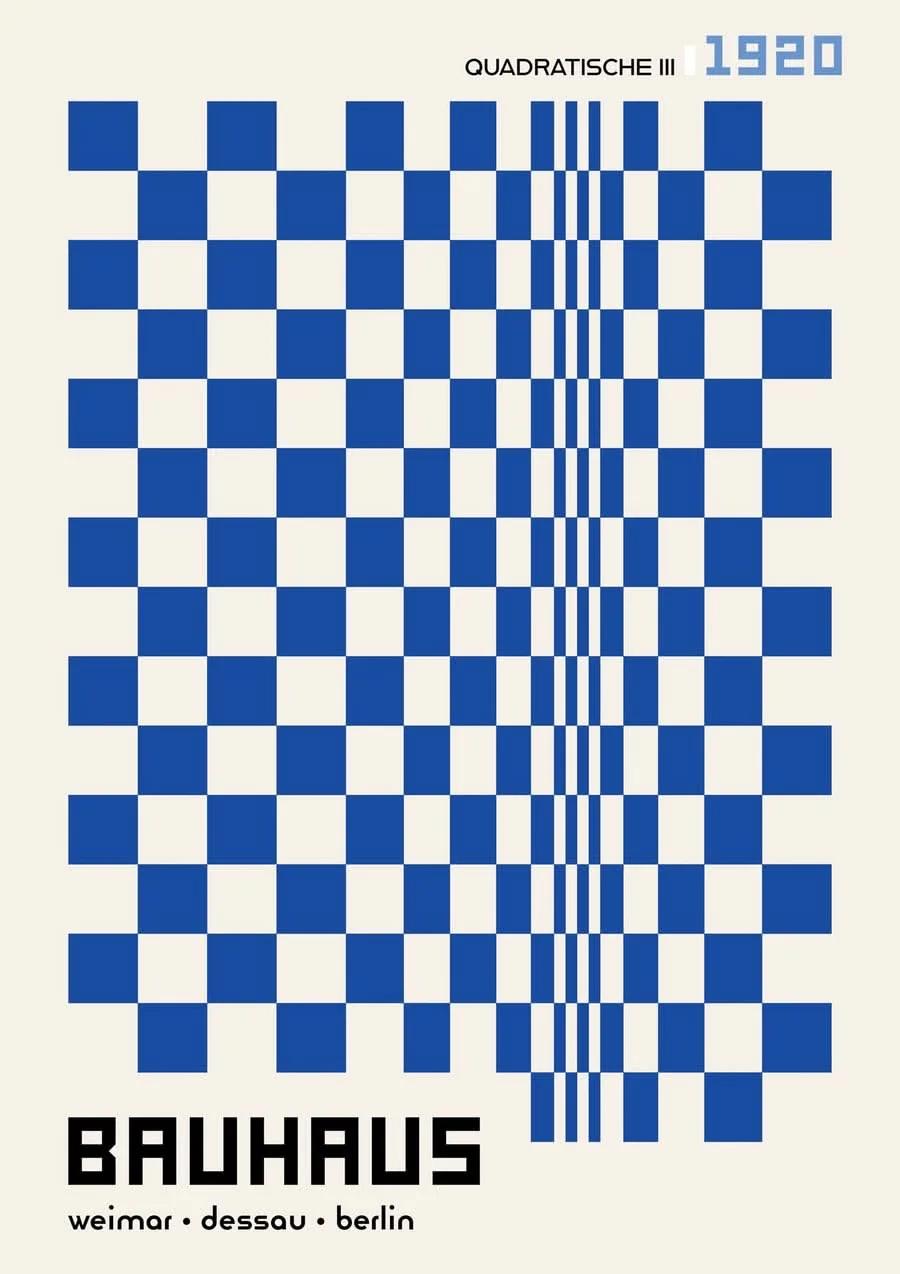
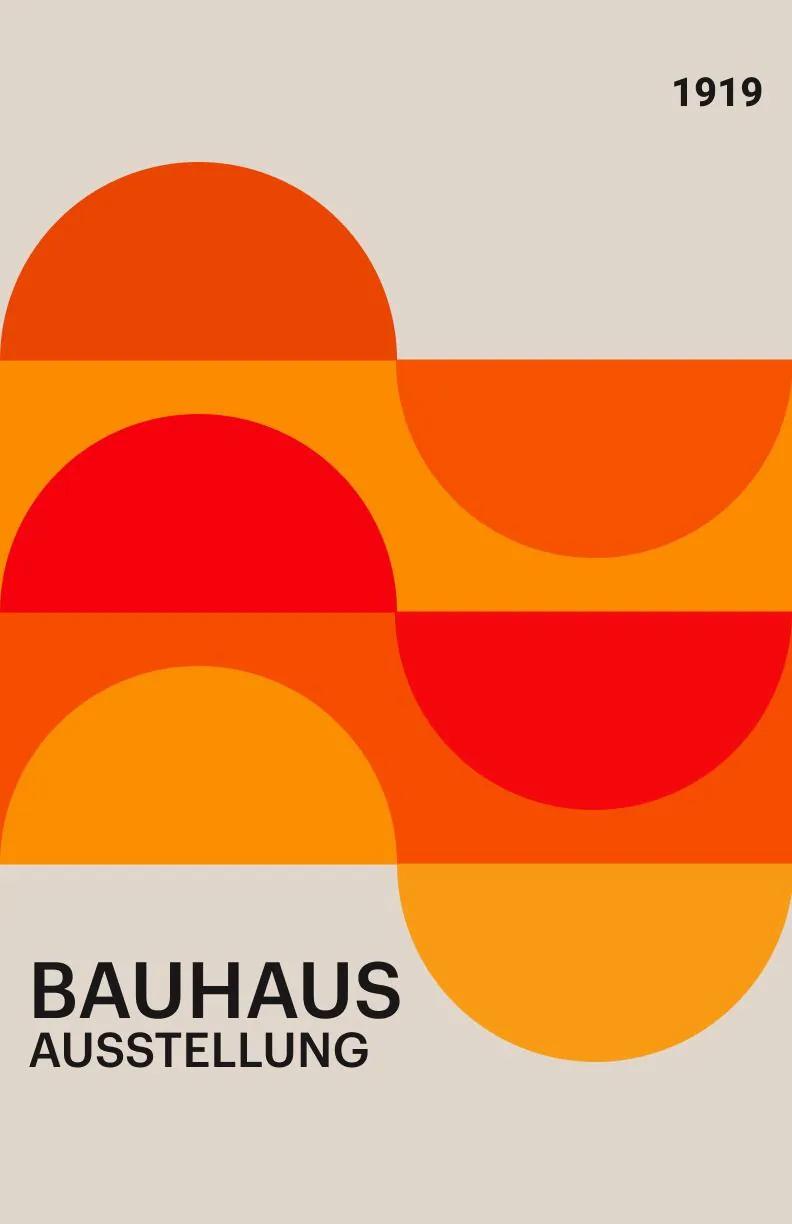
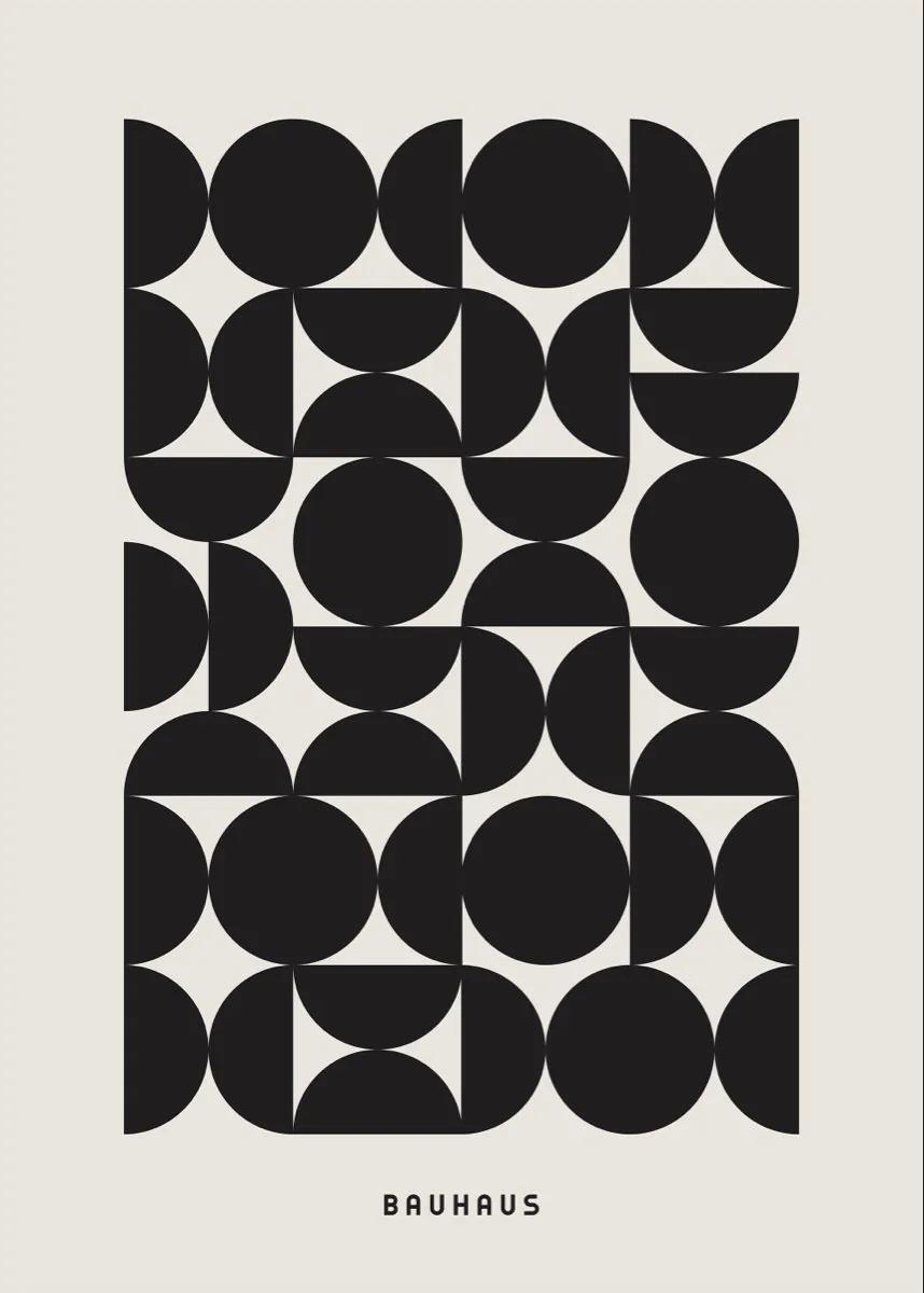
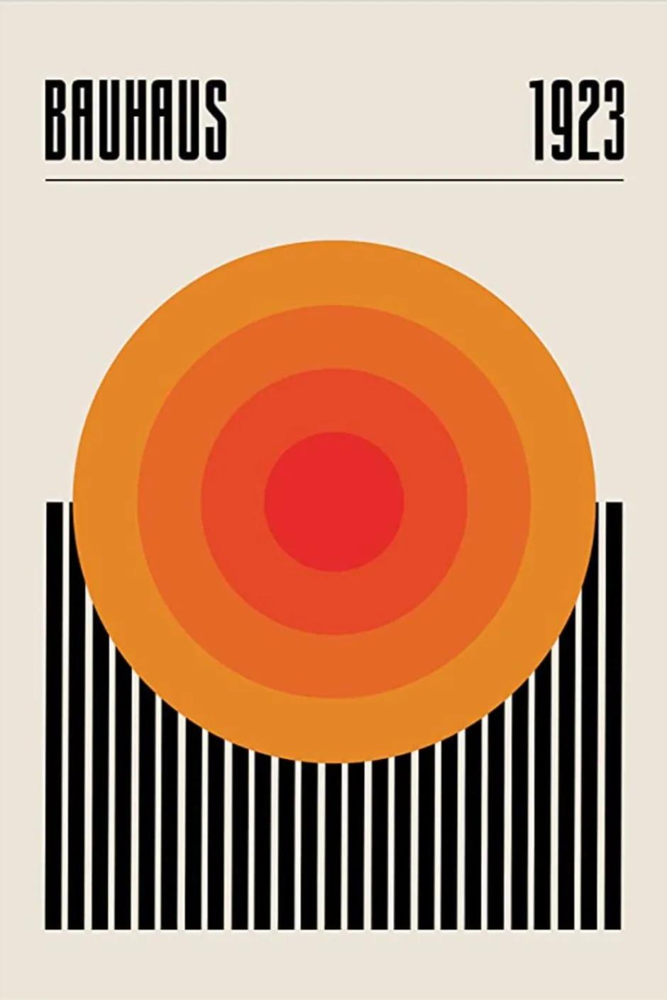
Bauhaus is a minimal visual direction defined by primary geometry, functional composition, modernist structure. It can help marketers create a recognizable visual system across campaigns, content, products, and brand communication.

SIGNATURE CHARACTERISTICS
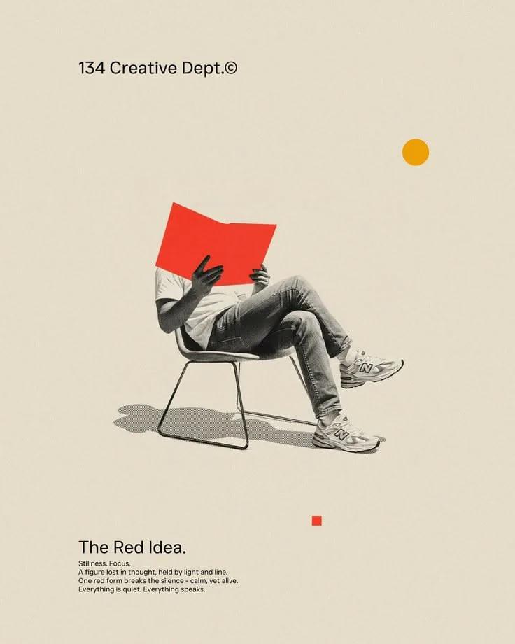
- primary geometry
- functional composition
- modernist structure
- restrained visual hierarchy
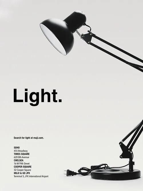
- generous negative space
- precise alignment

COLOR DIRECTION
Use a restrained neutral foundation with one controlled accent. Keep contrast intentional and avoid competing accent colors.

TYPOGRAPHY
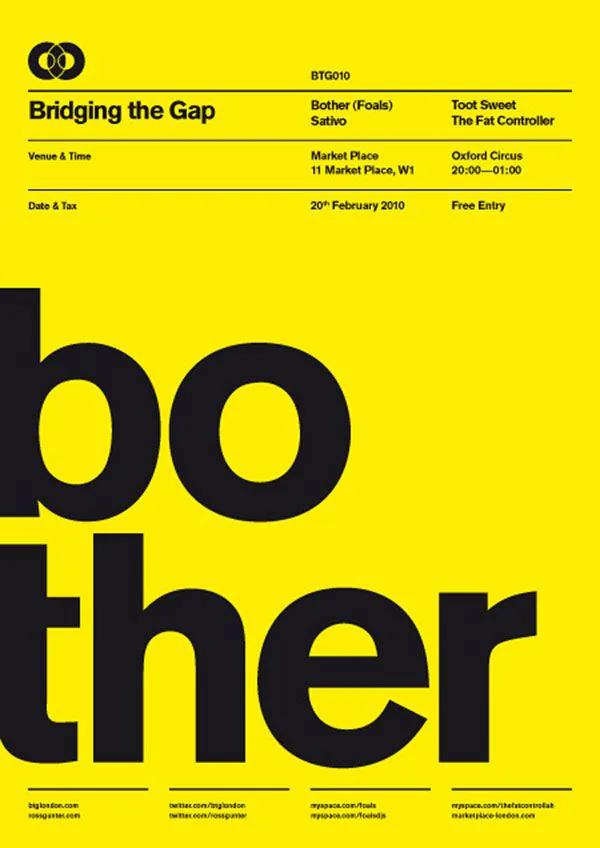
Use clean sans-serif or refined serif families with clear size hierarchy, moderate weights, and disciplined spacing.

COMPOSITION
Use a strong grid, generous margins, limited focal points, and deliberate alignment. Every element should have a clear purpose.

LIGHTING
Prefer soft, even lighting or controlled studio light with clean shadows and low visual noise.

TEXTURE AND MATERIAL
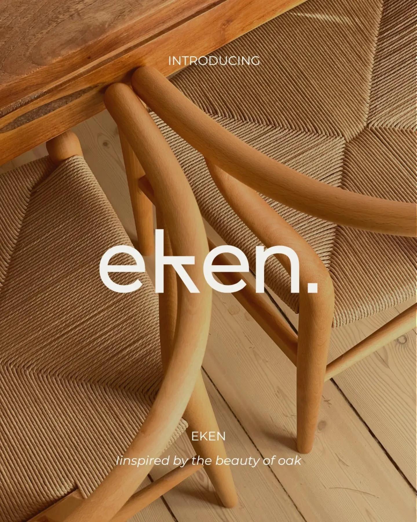
Use smooth surfaces, subtle paper grain, fine fabric, or very light material detail.

IMAGE TREATMENT
Keep crops clean, backgrounds simple, retouching restrained, and subject placement deliberate.

BEST USES
- premium brand systems
- product launches
- editorial campaigns
- professional social content

AVOID
- unnecessary decoration
- too many type styles
- competing focal points
- crowded layouts

PROMPT FRAMEWORK
Create a bauhaus marketing image featuring [subject] for [brand or campaign]. Use primary geometry, functional composition, modernist structure, use a restrained neutral foundation with one controlled accent. keep contrast intentional and avoid competing accent colors. use a strong grid, generous margins, limited focal points, and deliberate alignment. every element should have a clear purpose. prefer soft, even lighting or controlled studio light with clean shadows and low visual noise. Keep the final image suitable for [platform or format] and leave intentional space for [headline or call to action].