Gouache Style Brief
Gouache Visual Style Guide

SUMMARY
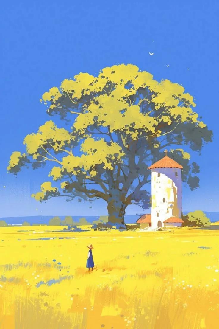
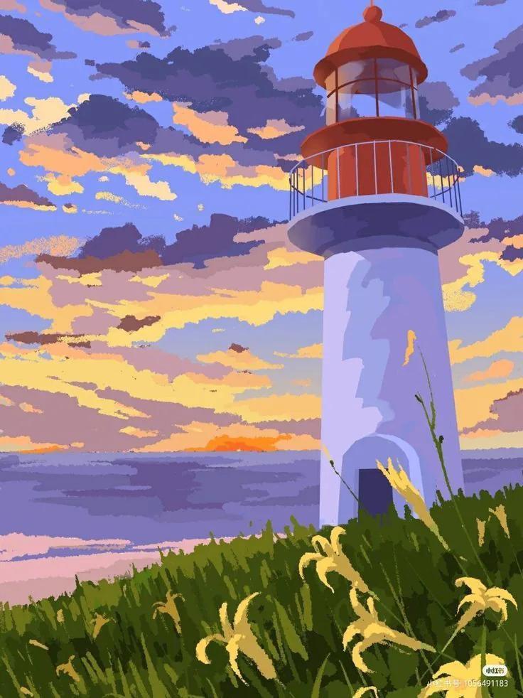
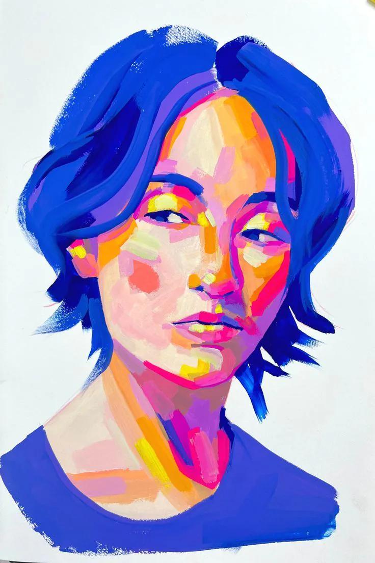
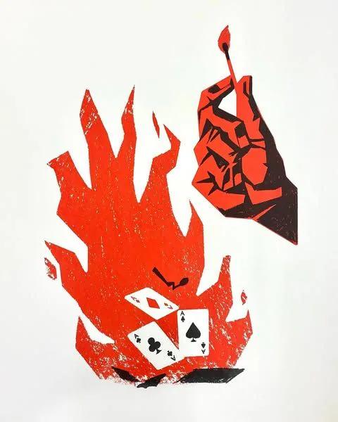
Gouache is a illustration visual direction defined by opaque paint, rich color, brush texture. It can help marketers create a recognizable visual system across campaigns, content, products, and brand communication.

SIGNATURE CHARACTERISTICS
- opaque paint
- rich color
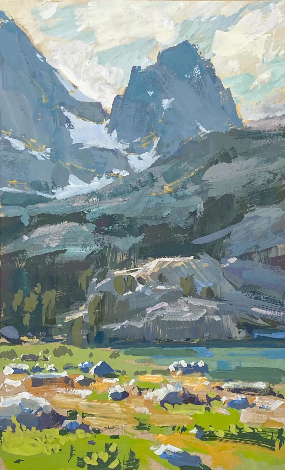
- brush texture
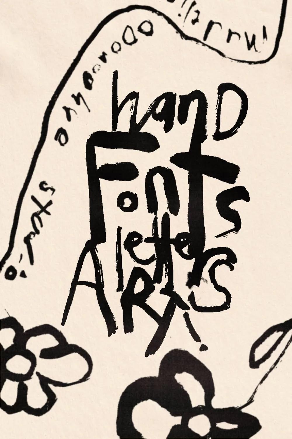
- intentional mark making
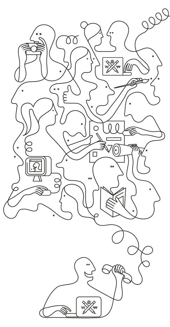
- stylized form
- controlled visual language

COLOR DIRECTION
Choose a deliberate illustration palette with clear value separation and consistent color behavior.

TYPOGRAPHY
Pair expressive illustration with typography that supports rather than competes with the drawing style.

COMPOSITION
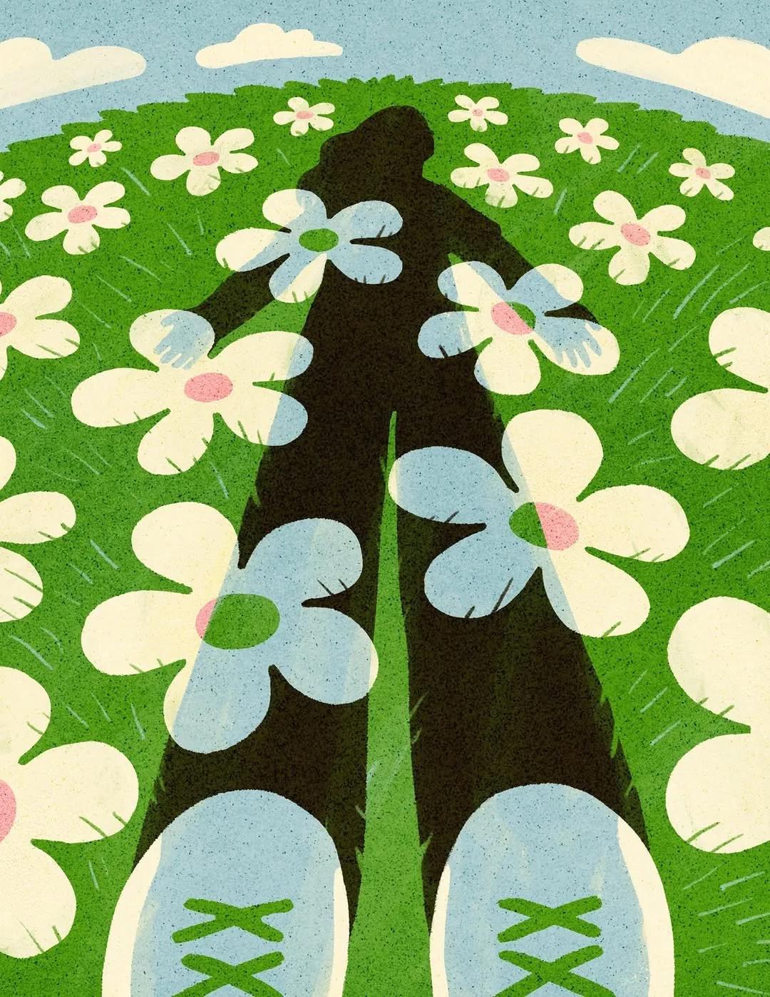
Use clear silhouettes, layered depth, visual rhythm, and intentional balance between illustrated and empty space.

LIGHTING
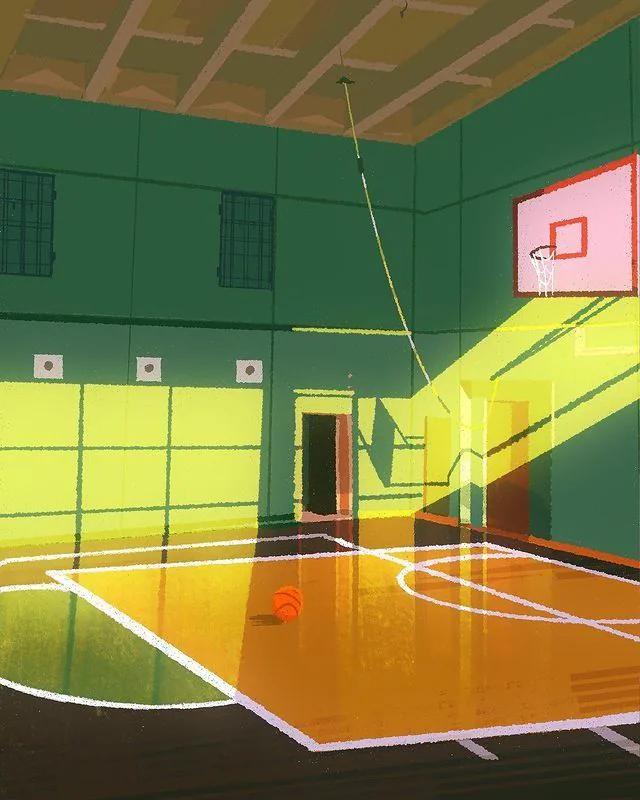
Represent light consistently through flat shapes, painted values, line weight, or stylized shading.

TEXTURE AND MATERIAL
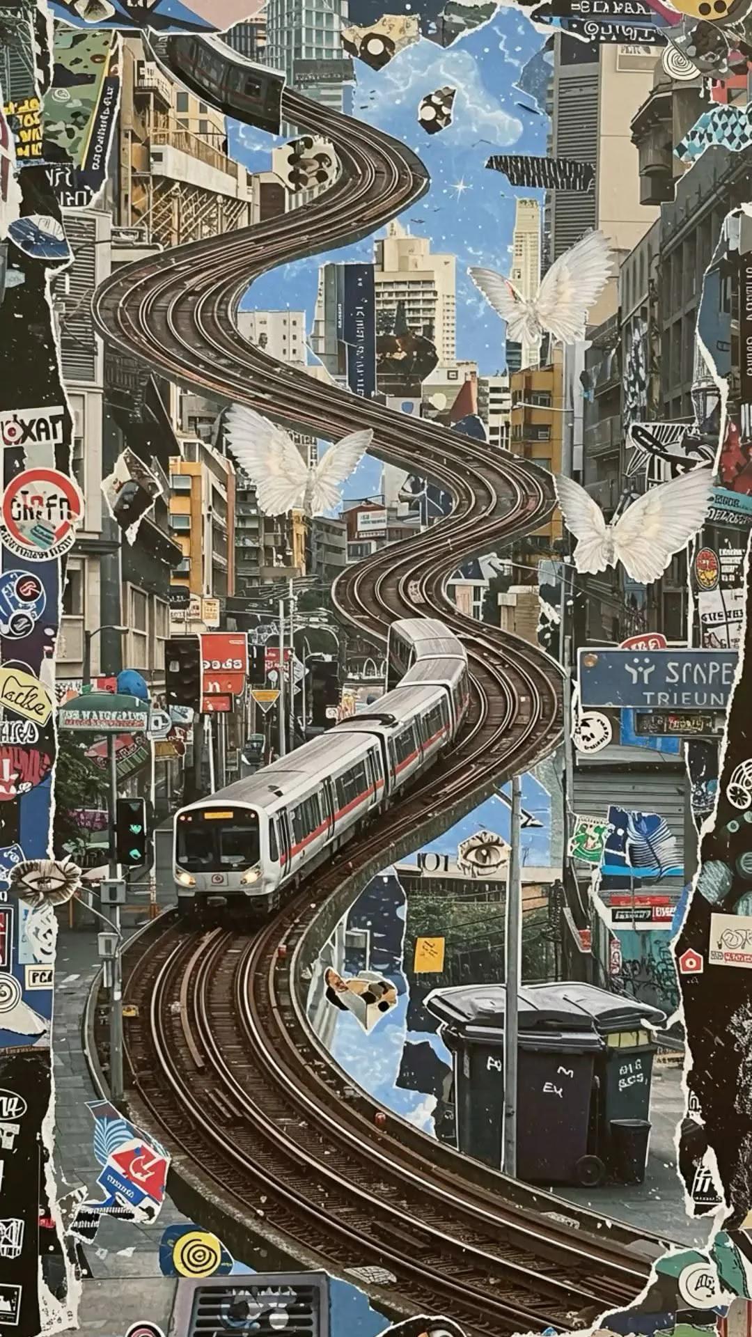
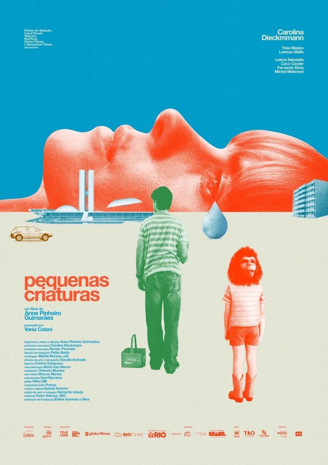
Use paper, brush marks, pencil, paint, print dots, cut edges, ink, or digital grain appropriate to the medium.

IMAGE TREATMENT
Keep line, shape, color, and texture consistent across the complete illustration set.

BEST USES
- educational content
- editorial storytelling
- brand campaigns
- social carousels

AVOID
- mixing incompatible drawing styles
- inconsistent line weight
- muddy values
- uncontrolled detail

PROMPT FRAMEWORK
Create a gouache marketing image featuring [subject] for [brand or campaign]. Use opaque paint, rich color, brush texture, choose a deliberate illustration palette with clear value separation and consistent color behavior. use clear silhouettes, layered depth, visual rhythm, and intentional balance between illustrated and empty space. represent light consistently through flat shapes, painted values, line weight, or stylized shading. Keep the final image suitable for [platform or format] and leave intentional space for [headline or call to action].