Typographic Poster Style Brief
Typographic Poster Visual Style Guide

SUMMARY
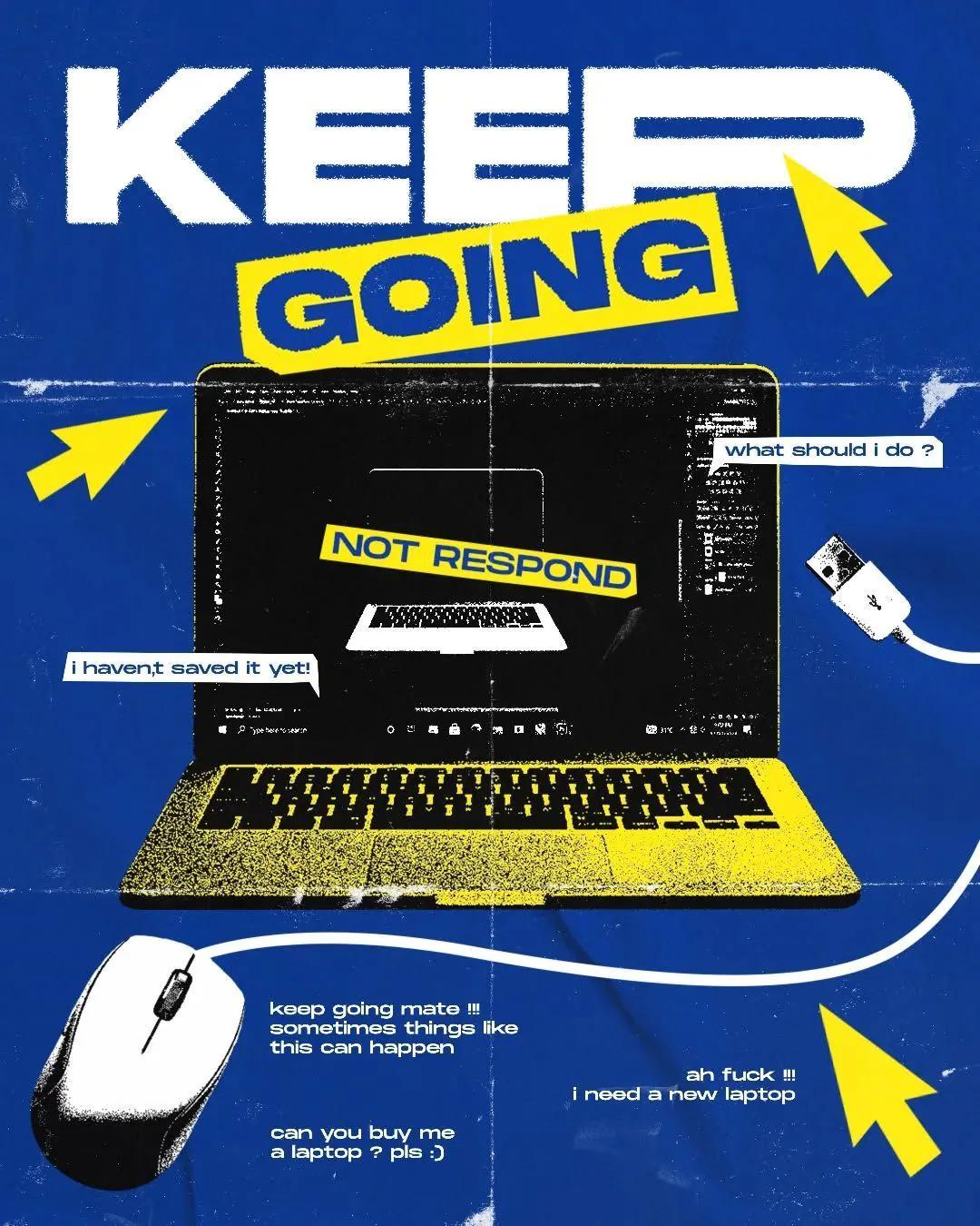
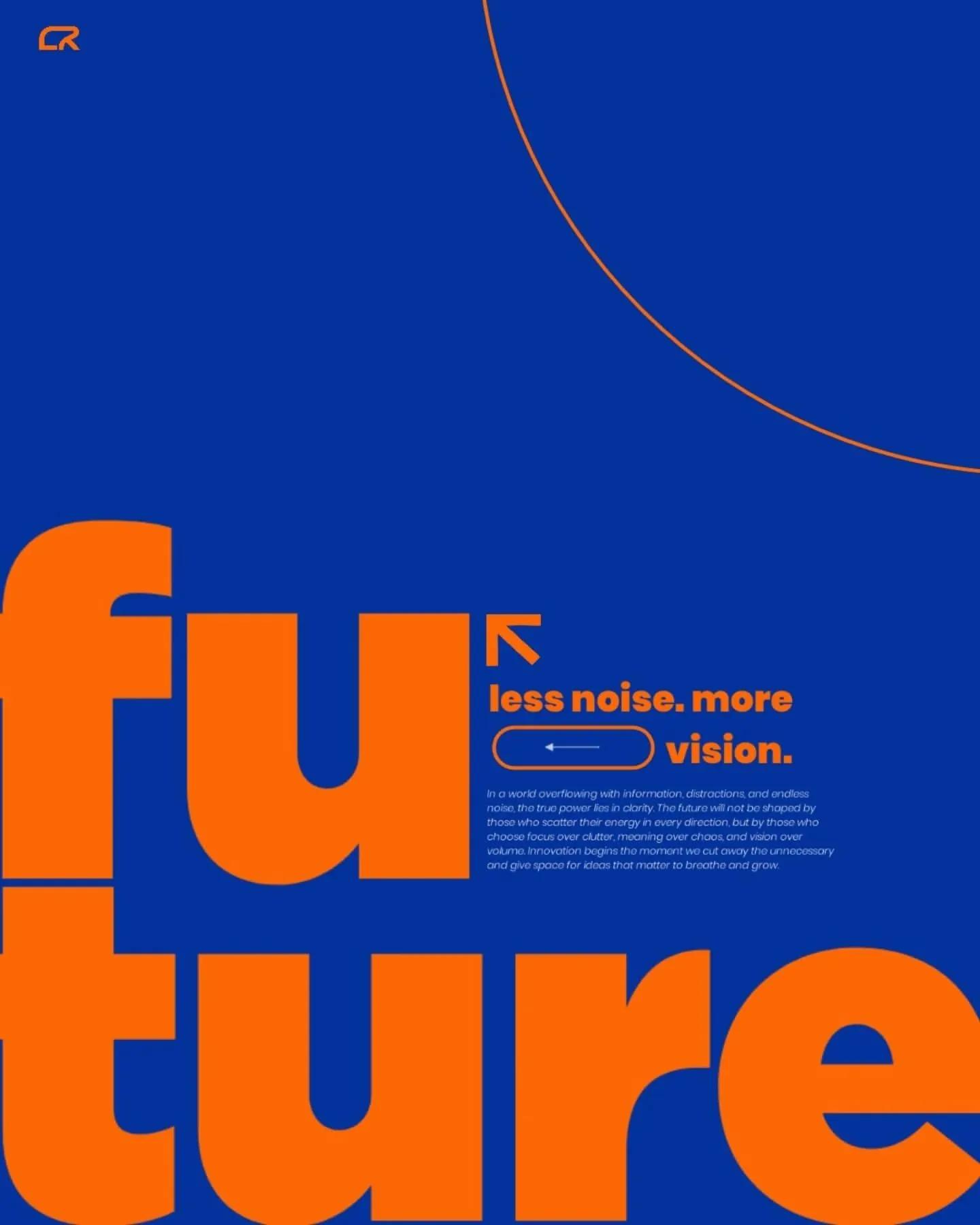
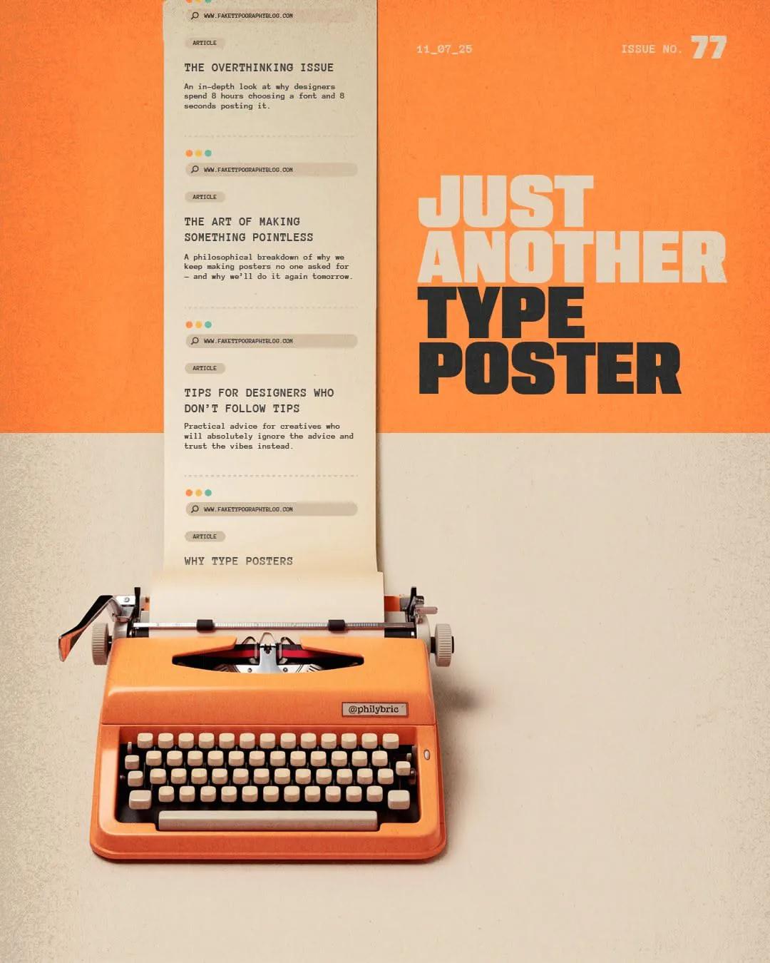
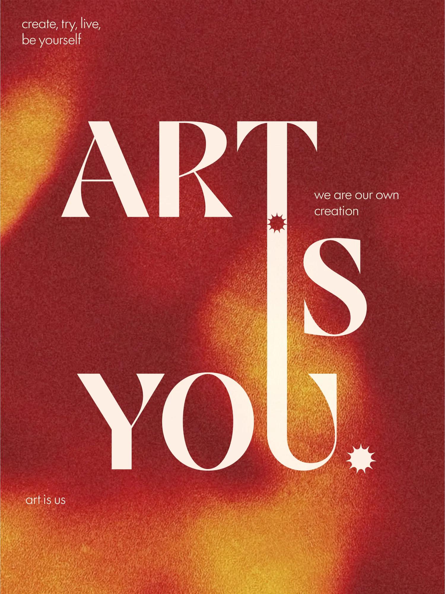
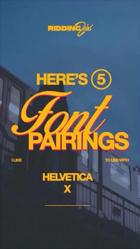
Typographic Poster is a graphic visual direction defined by display type, poster hierarchy, graphic rhythm. It can help marketers create a recognizable visual system across campaigns, content, products, and brand communication.

SIGNATURE CHARACTERISTICS
- display type
- poster hierarchy
- graphic rhythm
- shape-led composition
- typographic hierarchy
- controlled repetition

COLOR DIRECTION
Use deliberate color systems, clear value separation, and repeatable relationships across the complete campaign.

TYPOGRAPHY
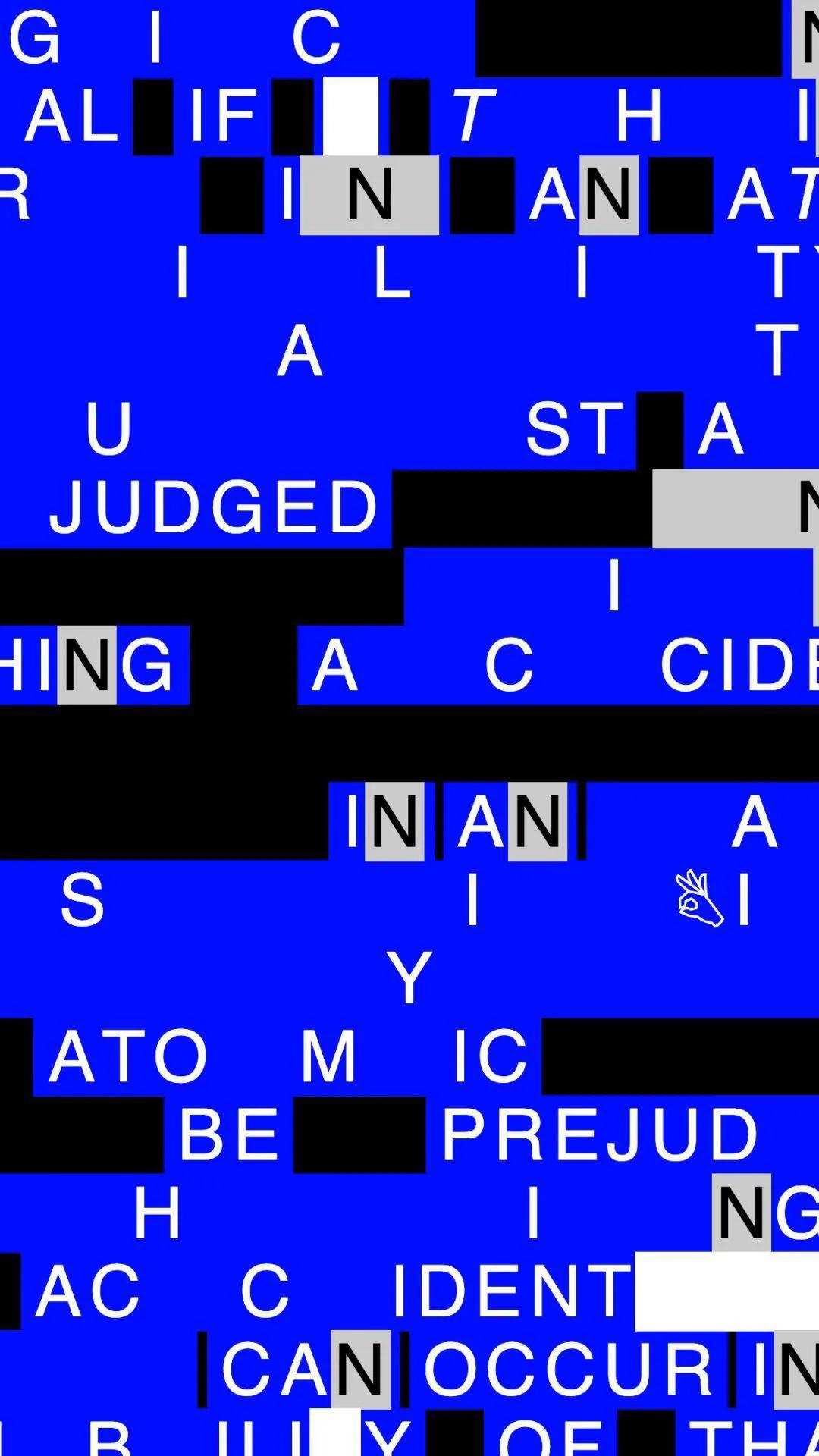
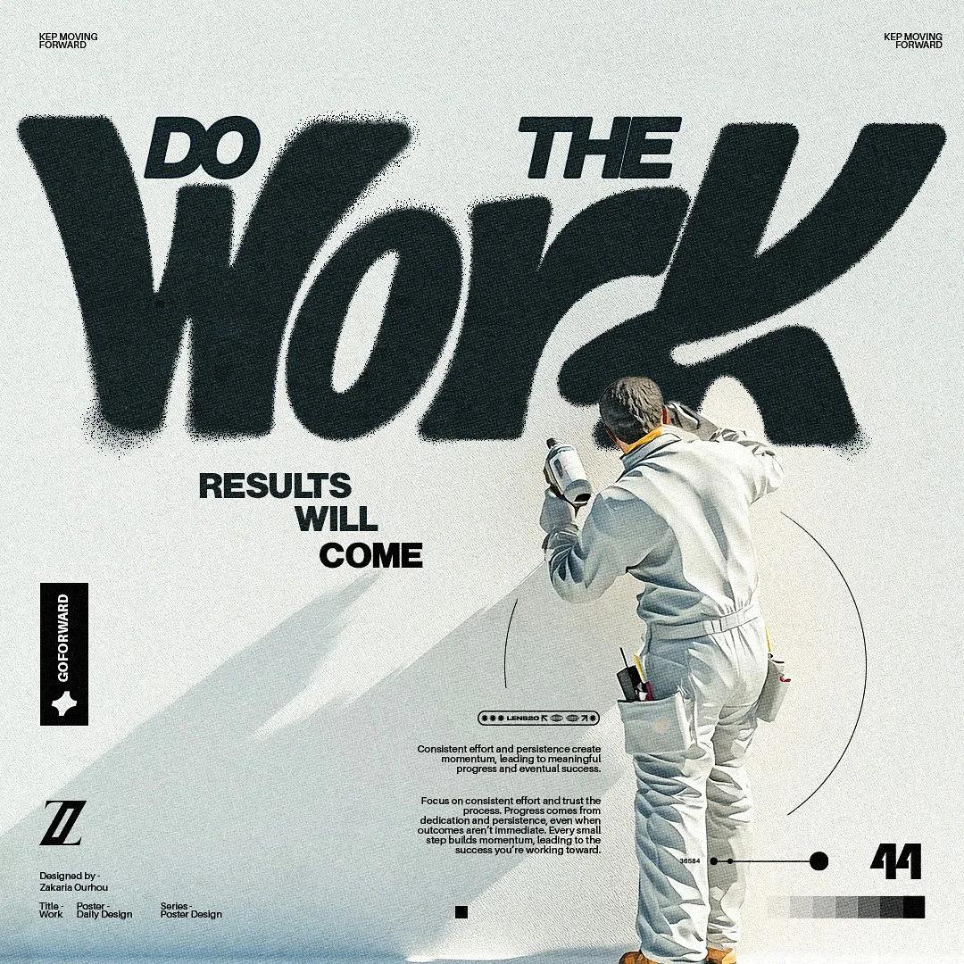
Treat typography as a primary graphic element through scale, rhythm, alignment, repetition, and contrast.

COMPOSITION
Use grids, modules, geometric forms, pattern, repetition, layering, and controlled visual tension.

LIGHTING
Use flat graphic treatment unless photographic or dimensional elements require a defined lighting system.

TEXTURE AND MATERIAL
Use gradients, halftones, grain, geometric patterns, paper, print artifacts, or digital meshes consistently.

IMAGE TREATMENT
Reduce imagery into clear shapes, controlled crops, repeatable effects, and a coherent campaign system.

BEST USES
- poster campaigns
- event promotion
- brand systems
- social content series

AVOID
- arbitrary decoration
- weak hierarchy
- inconsistent grids
- too many unrelated effects

PROMPT FRAMEWORK
Create a typographic poster marketing image featuring [subject] for [brand or campaign]. Use display type, poster hierarchy, graphic rhythm, use deliberate color systems, clear value separation, and repeatable relationships across the complete campaign. use grids, modules, geometric forms, pattern, repetition, layering, and controlled visual tension. use flat graphic treatment unless photographic or dimensional elements require a defined lighting system. Keep the final image suitable for [platform or format] and leave intentional space for [headline or call to action].